Whimsical Wood Blog Pages

Home Page www.whimsicalwood.com

This blog features the current woodcraft, Art and Graphic work of David Stanley.

Friday, September 23, 2011

Getting Back on Track Soon


Various circumstances, mostly not bad ones, have prevented me from keeping up to date with this tutorial and I do apologise for that to all who are following along. The main content of this blog and the pattern for 'young Dragon hiding' is to be published as a step by step magazine article by Fox Publishing in their next 'Pyrography Special Issue', under the banner of 'Scroll Saw Magazine'.  

This pyrography magazine had its inaugural issue published earlier this year. Consequent to this project being published I need to have the project completed, the article written and the accompanying photos prepared and annotated by the end of this month. This has meant that I had to start the project again in order to have photos of the process that are suitable for magazine production.

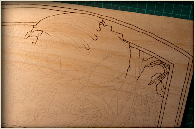
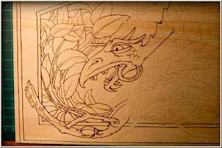
As explained earlier, this project has been experimental from the beginning and I have been feeling my way with it.  In my first attempt at re-starting the project I changed some aspects of it. The changes did not work out and I have had to start yet again with a return to the paint materials I'd suggested at the beginning. 

I have also now set up a more purpose made mini photo studio for taking the step by step photos and this should help with things in the future.    

Along with the need to prepare the  pyrography project for the magazine, I had a welsh lovespoon carving due for completion and this had to take priority over other projects. I'm happy to say the spoon has been completed and is on its way to its new owner.


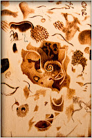
The spoon is carved from an extremely hard timber called saffron heart. Hard to carve but a beautiful amber colour and it takes a good finish. The spoon is nine inches long and features a celtic style dragon between the chain link and the bowl.


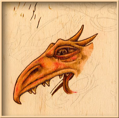
Before getting properly back on track with this blog I will need to complete the material for the magazine article.  In the meantime I will post some of the photos I have of current progress with this project.  I will have to do this with little or no instructional text at this point but just hope you can make some sense of the photos as they stand.  I will a bit later re-jig this whole tutorial into a more logical form.

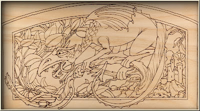
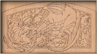
I have also made some changes to the original pattern in that I have included scales on the dragon body.  If anyone wants to have the new pattern with scales right away, then you can email me and I will gladly send you an updated pattern. Otherwise I will be placing the new pattern on my web site sometime next month. 


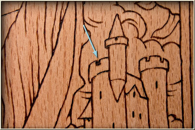
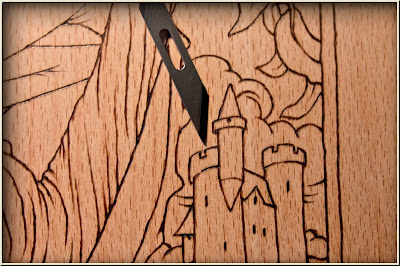
My manner of working on this project has been more intuitive than methodical in nature.  That is, I have tended to work on one section through to near completion, then move on to another area of the picture altogether and then perhaps to re-visit another area that has been already almost finished. 

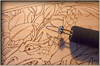
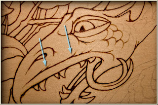
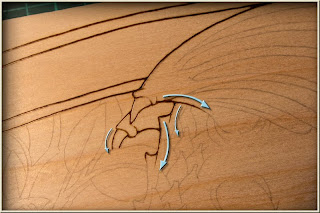
Just briefly for those following, After the water colour paint has been applied and it's thoroughly dry, I have then used the pyrography tip with the flat portion downwards to firstly burnish or polish the area I'm going to work on.  This is done with a very low heat, low enough so that little or no tone is imparted to the work, just a 'glazed' polish leaving a surface so smooth that the pyrography tool slips smoothly over the surface. 

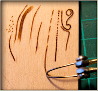
Keep the tip of the tool polished and polish the area you'll be working on. With the heat turned up just a little, just enough to gently tone the timber, start shading your work in a combination of short gliding strokes and sometimes little circles.  You will have to acquire a feel for this as you go and as you practice.  Think of it as painting the tone on in a layering process achieving darker tones by repeated passes and by lingering slightly in some areas.  Practice the technique on your scrap piece often and you will gradually gain confidence.  I will explain the technique I have used more fully when I write this Blog up properly later. 

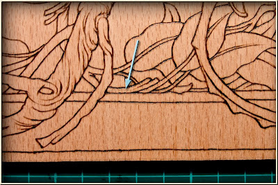
The other technique is the use of coloured pencils to add the main colour to your work.  Experiment with different colours some will work better than others and I don't just mean the hue involved but their handling characteristics on the pyrographed timber surface.  the trick is, like using a very low heat on the pyrography tool, use very little pressure and lay down the pencil pigment without impressing the timber at all. Then after applying the coloured pencil polish the area with a tissue until the colour appears blended with the timber.  You can lay colour over colour this way and finally polish the whole area with the very low heated tip of the pyrography tool.

This is a brief run down of the technique I have used.  I will deal with the finer points later and in the meantime will add progress photos of the project as I go.


Saturday, September 3, 2011

Adding Colour to the Pyrography


The whole image is now outlined and the colouring process can begin. This whole process of using colour in a pyrography work is new and experimental to me, so those following along may want to use their own judgement as they follow, perhaps taking some of the steps further or perhaps not as far as I have. It might also be a useful idea for some to do as I have done and render two versions of the work simultaneously – a second chance – a bit of insurance against ending up with nothing but a learning experience.
In my case, I have been working on two examples to give you an idea of the different effects produced by the differing characteristics of the two timbers I have used. This won't of course, provide you with any exact information but will serve to show how much effect the timber type can have on the final result.


To colour the timber I have used a non acrylic designer's gouache. I could have used watercolour paint but the gouache is less expensive for you to buy unless you have something already and acrylic could be toxic or otherwise problematic if pyrography is attempted over it. The colours that I have chosen, are those that I thought would be most compatible to use on timber.

We want to preserve the natural grain and appearance of the timber and so we will be using the paint as a thin wash. These chosen colours have also been mostly selected from the more transparent versions of the colour pigments. It just happens that the selected colours are also from the 'series one' group of colours which are the least expensive. Information about the various characteristics of the paint,such as transparency etc, can be found in brochures in the art store where you buy the paint.

The actual colours that I have used are: Burnt Sienna, Yellow Ochre, Burnt Umber, Any fairly transparent Orange ( I didn't have orange in gouache and so I used watercolour mixed from red and yellow ), Ivory Black and Permanent white, any white will do and white is of course not in any sense transparent but we will be using very little.

The other colours that will be used (later) are good quality coloured pencils like 'Lakeland' mainly reds yellows and browns, include a good dark red perhaps.


To begin start with the Burnt Sienna, with a very small dob of paint in a small white dish, Like a finger bowl Make a thin wash just pigmented enough to make a pale coloration on a scrap of your timber after drying. You will notice that the wet paint will be considerably darker before it dries and depending on the timber and can appear alarmingly blotchy.


The blotchy effect should disappear though, when the timber dries. Some pigments on some timbers, however can come up badly. Most pines have this problem, including the timbers that are not really pine but are called some kind of pine, like the kauri pine I am using. You will also most likely be using a timber that has this problem as many of the light coloured timbers fall into this category. This is one reason to be using a very thin wash and moving up to darker passages of colour by repeated applications. The other reason is to creep up on the effect we want and not overwhelm the timber grain.


The colours we are using will all be very altered by the underlying timber colour and that's what we want to do, just subtly shift the original timber colour and then add tone afterwards with the continued use of the pyrography tool. Blues and even greens would be even more drastically altered by the timber's native colour than those we've chosen and it would be wisest to leave experiment with these, more 'dis-similar-to-wood-colours' to another time.


You will need a suitable brush to apply your paint and I would suggest a number 6 pointed round brush. A synthetic 'sable', rather than the real thing, would do and is much cheaper.

When you have a suitable Burnt Sienna wash prepared, lay in a wash within bounded regions of the dragon. Try to have enough of the watery paint on your brush to fill as much of the area you are painting as possible. As you come near the end of the brushes capacity in a passage of paint you are laying down, try to leave a wet-ish edge to add to, with a re-loaded brush. Stir and re-mix the water and paint every now and then as the pigments might settle and give you inconsistent densities of colour. You will notice this more with some pigments than others.

Think ahead, about how you will lay in the paint in the region you are working on and turn your work to get the best approach to it. This is a basic watercolour painting technique and you can get a better handle on the process, if you are not familiar with it, by googling 'watercolour wash technique'.


Putting down a watercolour wash on timber will differ somewhat from watercolour on paper however and that's another reason to use a very thin wash of paint to begin with. It's also another reason for you to use your own judgement in how dark you want to go with any of the colour applications to your work before continuing with the pyrography. You may decide, if you are having trouble with this part of the process to do less of the colour wash and rely more on the pyrography effects later.

As this is an experiment for me as well – who knows? – any decisions that you make that deviate from the path that I show, could just bring you to a better result. I only partially know what I am doing with this project and working with timber in general often precludes a predictable and methodical approach as the material imposes it's own variable nature on the task. I find design is almost always like this and it requires groping your way intuitively toward a solution, with only a few guiding principles.


Having mentioned 'principles' in the midst of a fairly relativistic account of 'what's a true way of working for me but might not be so for you', way of crafting, I will take the liberty, (I've often been accused of arrogance for this) of asserting briefly; That in real life, basic certainties (principles) can be known and be known certainly.

When I say basic, I mean really basic. We like to make things and we make those things, not according to time, chance and necessity, but we make them often for the love of someone else. We ourselves have been made and we've been made by a person who really knows things. How we've been made might be a matter of experiment- guided pondering but 'that we've been made', is an absolute certainty. When someone who REALLY knows (Our Creator that is) tells you a thing, then and only then, do you know that thing with an absolute certainty. Not believing that Person, robs you of knowing, but what he has spoken remains, the certain truth, nevertheless. The person who made us has told us things, in a word; Bible. In another word, The Word, Jesus Christ, cf. John Ch1. These certainties stand in contrast to the uncertainties of all that we do and say.

I did say that I would divulge my inmost thoughts as I went along with this project, the whys and the hows. So let's plunge again into the uncertainty of my leading and attend to the hows of this project partly based on past experience and on a lot of experiment, in order to finish the colouring on our outlined dragon. If you feel confident you can try adding some shading to the perceived shadow areas on the dragon, refer to the tonal pattern for this. Or you could just leave the painted areas as flat tones.


I painted in shading on most of the picture as I went along but only time will tell as the pyrography is completed, if the image becomes a bit heavy looking as a result. Again you use your own judgement and hang back if you think I've taken any part of the process too far.

When the dragon is completed then paint in the leaves and part of their stems with the yellow ochre in the same manner. Paint the branches with the burnt Umber and wash in orange over all the sky areas except the clouds. Nearing the end mix a very thin wash of Ivory Black and wash this over the whole sky area, after the orange is thoroughly dry of course ( a hair dryer can help here ).


Now this part is tricky if you want to attempt it. Keep adding more layers of black wash over the top portion of the sky and the left portion to try and get a graded effect across and down the sky. You will find that this is a matter of guesswork all the way, because the wet paint passages look so dark to begin with and you have to wait until it is dry before you can see the true result. The black paint brought out the grain in the european beech quite markedly in my piece and it remains to be seen if this will be a good or bad effect.


Last of all we can now add some touches of white to the clouds and the castle areas but keep it very dilute as the opaque white paint will have an overpowering chalky look if it is overdone. Now that all the underpainting areas are laid in we can commence the continued pyrography work to bring out the modelling in the elements of the picture.


I hope that along the way you have come across other possibilities for decorative effects that could be undertaken using pyrography lines with watercolour paint on wood. Try to keep an eye out for other directions you might take with the techniques you discover as you go and carry out your own experiments on your scrap pieces.


Wednesday, August 24, 2011

Outlining the Design


Now that the image has been transferred to the timber we can start on the actual pyrography. But first we will need to consider the type of point we will use to carry out the various stages of the work.


I have used the original nib that came already attached to a Razor Tip pyrography pen that I recently bought as a second pen. I bought it to provide the convenience of not having to change nibs too often. I typically only use one or two nibs for my pyrography work and the one I use most, is one I have shaped from the wire they supply for making your own nibs. This nib is shaped to accomplish as many different tasks as possible and to avoid having to frequently change nibs.

For this exercise I have chosen to use the supplied nib and not my usual one as it is more likely to be the same as something you already have. At a later date I will demonstrate how I alter nibs to suit my own preferences, if it seems the information would be useful to anyone.

There is one small modification, if you can call it that, which we should make to the nib and should do from time to time as work progresses. That modification is to polish all the area of the nib that we might be using on the timber. To do this I have a small piece of MDF with a little fine abrasive compound rubbed on, something like rouge would do. It just requires the nib to be polished on this until a bright smooth surface shows, a quick wipe on a tissue or rag and the nib is in prime condition to do its work. From time to time a quick touch-up will keep it that way.

Now before the actual work begins on the project I always like to test the nib's temperature on a scrap piece of timber and I often do a fair bit of 'doodling' and experimenting with the mark making possibilities of the pyrography tool before I commence a new project. This is often time well spent finding out what the tools can do and what you can do with the tools.


Now onto this actual project, select a very low temperature that will barely make any impression on the timber and increase this by tiny amounts until you can easily make a good dark line, with no blobbing – slowly – on your scrap test piece. When you have this working just the way you want, you can start 'drawing' over the transferred line on your timber or board.


Start with the lines of the outside border first and try to produce a good black consistent line with the thinest edge of the nib. Do this by using short overlapping strokes building up the darkness of the line as you go, just gliding in from above the work surface touching the surface with just a little pressure and then gliding off the surface again. The short strokes can be as short as dots if need be and increased to longer strokes as you gain confidence. Practice this on your scrap piece if you need to, but don't worry about speed, concentrate on the quality of the line.


The quality that you are after in the line is a good dark tone and a fairly consistent thickness. You will notice that the lines in the pattern are not straight, as if they'd been done with a ruler but they undulate very slightly and there is even the odd deliberate kink in the line work, pyrography lends itself well to this particular style. Deliberate and confident but nevertheless lively and 'organic' is the aim as you draw over the lines. Have a look and study the work of illustrators like Arthur Rackham and Heath Robinson and see how much is conveyed by the line-work alone.

See how the line bounding the top of the upper lip of the dragon is actually composed of a number of lines, each flicking off in arcs to suggest a curved surface above it. In all such instances render individual lines carefully and deliberately letting their sum total come about of its own accord. It is the character of the lines that you draw in a line drawing that enables more to be conveyed to the viewer than just a boundary, the line can suggest and insinuate what lies above it and below it. It can begin to show the topology of adjoining surfaces like tonal shading can in a more tonal drawing. So whenever you draw a line try to have an awareness of what your drawing is indicating about every thing outside the line you've drawn. Think out side the lines.

This picture will depend a lot on the line work involved and so as we progress it will be the focus of much of our attention. After all the straight parts of the border lines have been completed we can turn our attention to the the rest of the work, noticing how the lines relate to one another, how lines join other lines, how the convergence of one set of lines relates to another set of converging lines.

I'm trying to show in the photo above where it might be best to begin and end the lines you are drawing in order to keep the relationships of the lines to one another.


An increasing awareness of how the line-work functions in a line drawing will enable you to make more and more shrewd choices as to how you will render over the pencil lines already there. It will also enable you to make useful changes and corrections to your pencil tracing and even to the original design as you progress. I found myself making small additions and corrections as I went, I can't say what they were because there were many of them and they were small changes.


One change that I will point out was where I deviated a little from the path drawing the border, the problem began due to inattention and the line I was drawing began to head in a direction away from the horizontal line I was supposed to be following. There was no way to erase as much work as I'd need to to fix this and an abrupt jump back to the proper path would destroy the integrity of the whole line so the only option was to gradually return to the original path over some distance. This is usually the best option when you start to go off course.


On the subject of erasure, it can be done, even extensively if there is sufficient thickness of timber. It can be done by scraping with an extremely sharp blade and or sanding the surface. The veneer on the working surface of my board was extremely thin however and when this is the case the options are less. Small blobs and small errant lines can be removed with careful scraping and I have shown this in one of the battlements on the castle.

Here you can see where a small erasure has been successfully made with a small blade to scrape away the unwanted bits.

As you continue to render the work onto your board remember to turn your board often to get the most comfortable hand position to draw your lines, keep the ball of your hand on the inside of all curves and devise strategies as you go to draw the lines in an order that will maintain their relationships as you draw them.

I am showing two versions of our project here one on European Beech ply and one on Kauri Ply to display the different effects that show on the different timbers. The Kauri is probably most like the timber you will be using if you are in our region of the world (Australia).

Kauri

European Beech

In the next post we will be moving to adding the colour and tone to our project. As this approach, adding colour will be new to me as well I've experimented on some scrap to give some idea of were we will be headed with the final rendering. The process will have stages and therefore options as to the final however. So take your time and above all enjoy your work.


Tuesday, August 16, 2011

Pyrography Tutorial 'Young Dragon Hiding'


The relief carving of the dragon shown earlier was not finished in time but has been put aside until later while I finish a lovespoon carving. In the meantime I am posting this tutorial on a pyrography project that will be a bit different from the pyrography that I've done in the past.

This pyrography project will be more decorative in nature mainly relying on line work, with only a moderate amount of shading and also the addition of colour. I will be using the pyrography picture produced in this tutorial to cut a hand-crafted jigsaw puzzle after the art work is completed. A number of people will be following along using the same pattern so it will be a fairly detailed step by step process. The pattern used is in fact the same pattern I designed for the relief carving earlier.

This pattern will be available soon on my website in the pyrography section and will be available to anyone who wants to download the PDF file to use as a free pattern and follow along with the tutorial. The design itself is of course copyright and cannot be published or sold. You can use the pattern for your personal work and you may sell any craft works you personally make as an individual, not in the course of employment, provided you acknowledge the source.


Pyrography Tutorial 'Young Dragon Hiding'

I will be posting and adding to this step by step tutorial as regularly as I can find the time to do so and I will begin with the process of transferring the image from the pattern to your timber.

First obtain a relatively light coloured piece of timber at least 340mm X 190mm to accommodate the pattern. Sand the surface of the board thoroughly with 400 grit paper until it has acquired a soft sheen. 400 grit should suffice in this project as we will not be using a great deal of subtle shading. I often sand the surface to 600 or 800 grit. always sand with the grain of course.

Print your downloaded patterns on some 'bank layout paper', this is paper that is not as transparent as tracing paper but is still fairly thin and translucent. You could make do with anything close to these characteristics that will go through your printer.

Use cut down A3 size paper, because the image is just over 4cm longer than A4. If you only have an A4 printer like me then it might have a 'double A4 panorama' setting that will allow the entire image to be printed on cut down A3 paper equal to A3( 420mm ) long but 210mm wide. Otherwise You'll have to print two A4s registered and taped together.


With the grey line pattern printed on suitable paper, firmly apply a good coating of graphite from a 4B to 6B pencil on the back of the print directly over the lines. You can see the lines through the back of the paper because the paper is translucent enough to allow it. Otherwise you'll have to cover the whole back of the paper with graphite. Get a good coating on, because you don't want to have to repeat the process if you can help it. When you turn the print over you will still see the grey lines because the paper is opaque enough. Had you used regular tracing paper it would be too transparent and you would not see the lines you need to trace

The next step is to hinge the paper to the top edge of your board and then you can trace carefully over the grey lines with a blue biro ( it will show up where you have been and if you want to trace off another you can, using a darker biro, given there is sufficient graphite on the paper ). The reason for the grey lines should now be apparent and also the use of bank layout paper, which being thin, helps you to press through with an easy amount of firmness and get a good impression on the board without denting it too much. Do not trace the whole thing just yet, just one short line or two. Then you can lift the paper to see if you are getting a good transfer.

When you are satisfied that it is going to work, after checking, smooth the paper down flat again and tape it taught at the bottom with just a couple of short pieces keeping every thing firmly in place. You can now trace the line work onto your board with confidence if you use the same pressure you tested.


Trace over the entire image using short easy to control strokes. Take it slowly and carefully, a clean careful transfer will pay great dividends when it comes to rendering your work with the pyrography tool later. In fact try not to think of this process as tracing at all but drawing instead, a drawing that you will be doing two to three times over for just one result. Lose concentration, or skimp on effort, in just one of the processes and it will affect the rest of your work adversely.

During the 'tracing' process use all the tricks you know for drawing in general and treat it as a drawing exercise. For instance turn the board around from time to time to be able to follow the lines comfortably. Keep the ball of your hand on the inside of any curves you are drawing, so as to use the natural arc of your drawing hand and not awkwardly fighting against it. Rest you hand if necessary, you're not working to a deadline.


Try to get an understanding of the drawing as you go, notice how the lines relate to one another the way they join one another, at what angle they join, see when one longish line here or there is really a confluence of other joining lines and draw each of the separate lines that join to make it, rather than following the more economic conclusion of simply drawing what you think it pretty much seems to end up as. Analyse all the aspects of the line work as you go and treat the whole process as a drawing lesson. If nothing else it will keep this part of the job from being a mindless and boring process. Besides, pyrography is pretty much nothing more than drawing anyway, drawing on a particular kind of surface – wood in this case, with a particular kind of tool, pyrography pen, in this case.

When you've finished and all the grey lines are now blue biro, remove the paper. A distinct transfer of the original should now be on your board. The lines on the board will consist of a good many loose graphite particles that will soon make your nice smooth, light coloured timber board, into a quite 'grubby' smooth board, not as light coloured as it was formerly. The remedy is a piece of kneaded eraser, or 'Blu Tac' will do. Form the piece of 'Blu Tac' into a point, dab it all over the lines, picking up the loose graphite powder from the surface of your board. You will now have a very light but useable image to work from. If there are any places that have been lost or are too light to read, then you can touch them up carefully with an HB pencil and generally tidy up the transferred image.
That's the second time you've worked on this drawing and the actual pyrography will be the third if you don't count some of the extra details you will be drawing in later.


All the extra work that is put in at these preparation stages is going to make the final result so much easier to achieve and also far better in quality at the end. So next thing we will prepare the pyrography tools for action and commence building up the image on our board.